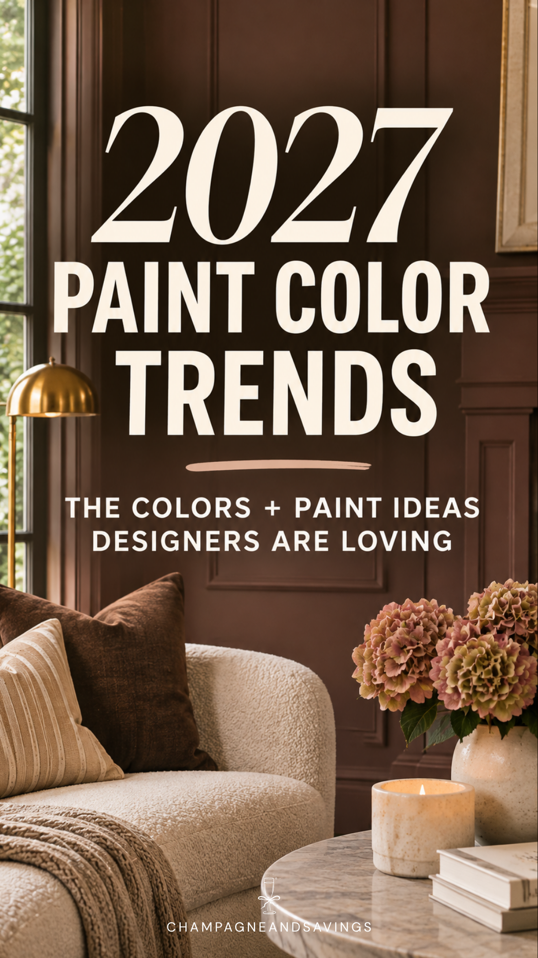
Okay, I don't know about you, but lately every time I see a gorgeous room on Pinterest, I immediately start wondering what paint color they used.
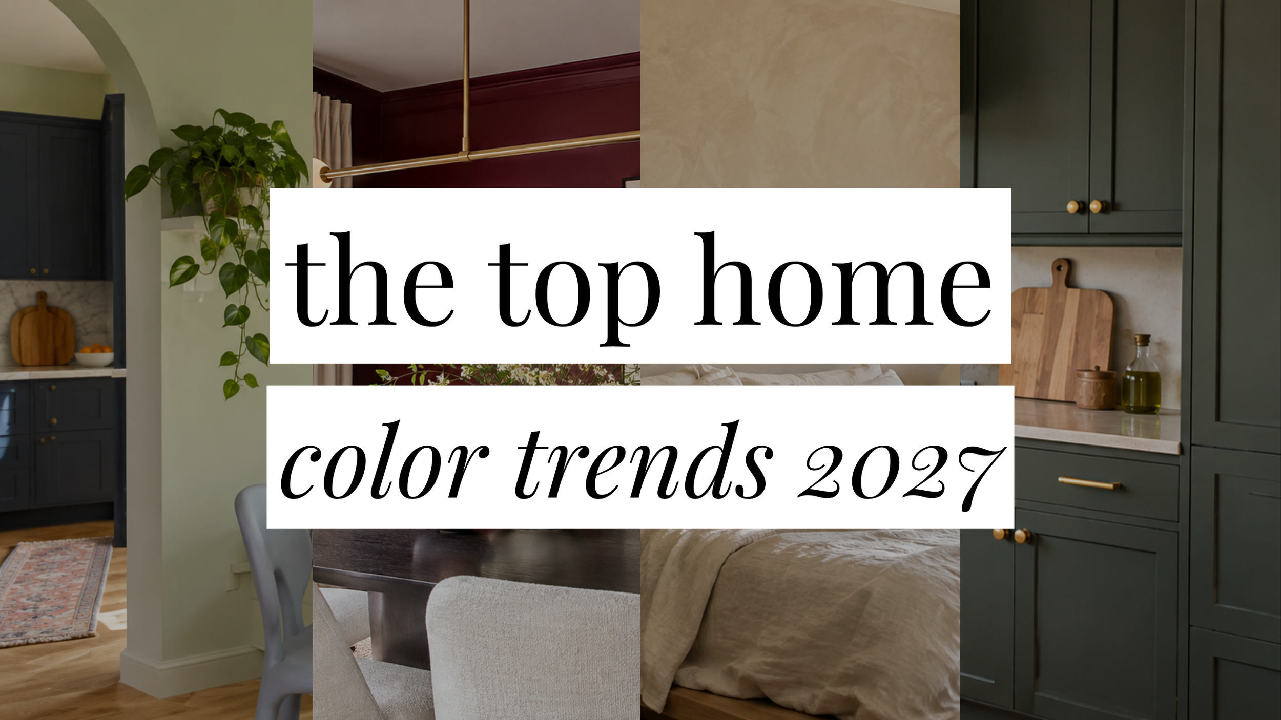
And the 2027 interior paint color trends are not helping my urge to redecorate literally everything.
We're talking rich greens, chocolate browns, buttery yellows, and some really pretty unexpected colors that I never would've considered putting on my walls a few years ago.
But what I'm actually most excited about is how people are using paint. Color-drenched rooms, painted staircases, gorgeous glossy doors, even little hand-painted details that make a room feel one of a kind.
There's just so much more personality happening in interiors right now, and I'm very much here for it.
So whether you're planning a whole room makeover or just looking for an excuse to finally paint that one thing you've been putting off, here are the paint trends I think are worth knowing about for 2027.
Love home decor trends? Don’t miss this post:
The Top Home Decor Trends for 2027 That Are Seriously So Good
Trending Interior Paint Colors for 2027
1. Rich, Classic Greens
I feel like we've been talking about green paint forever at this point, but I'm honestly not sick of it.
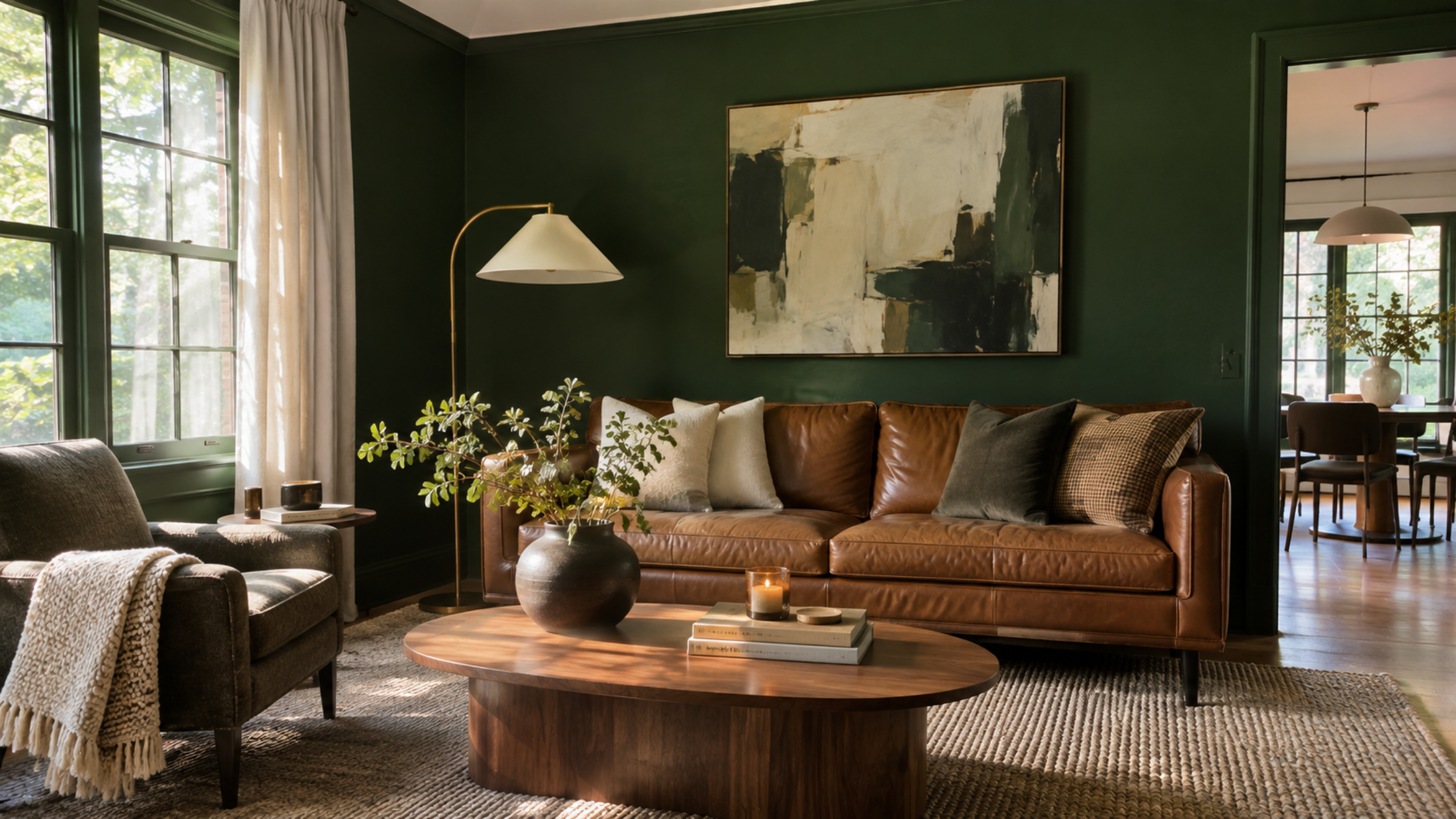
Especially now that we're seeing these richer, more traditional greens instead of the same pale sage everywhere.
Benjamin Moore's 2027 Color of the Year, Webster Green HC-130, is such a good example. It has that classic, slightly moody look that makes a room feel like it's always been that color.
I could totally see this in a home office with a big wooden desk and some vintage artwork. Or in a dining room with dark wood furniture.
It's one of those colors that feels trendy right now but isn't going to look ridiculous five years from now.
2. Soft Celery Green
Okay, this one surprised me a little.
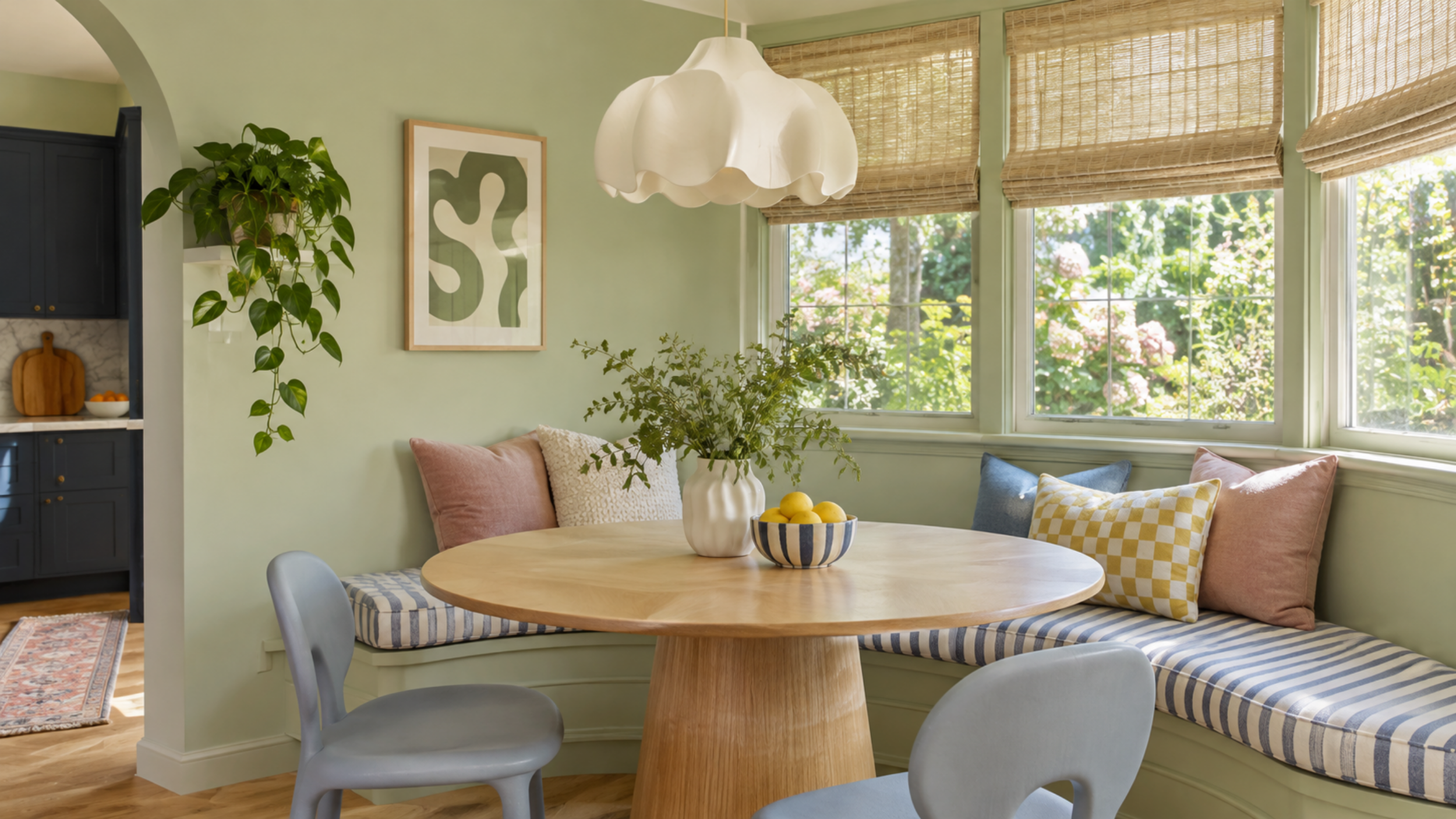
Sherwin-Williams picked Celery SW 6421 as its 2027 Color of the Year, and it's definitely not the green I would've expected.
It's lighter, a little more yellow, and has this fresh, almost cheerful look to it.
At first I wasn't sure how I felt about it, but the more I picture it in an actual room, the more I get it.
Imagine a cute little breakfast nook with celery green walls, a vintage wooden table, and cream curtains.
Or even kitchen cabinets in this shade? So good.
It's a fun alternative to sage if you're ready for something a little different.
3. Chocolate Brown Walls
I never thought I'd be sitting here trying to convince people to paint their walls brown, but here we are.
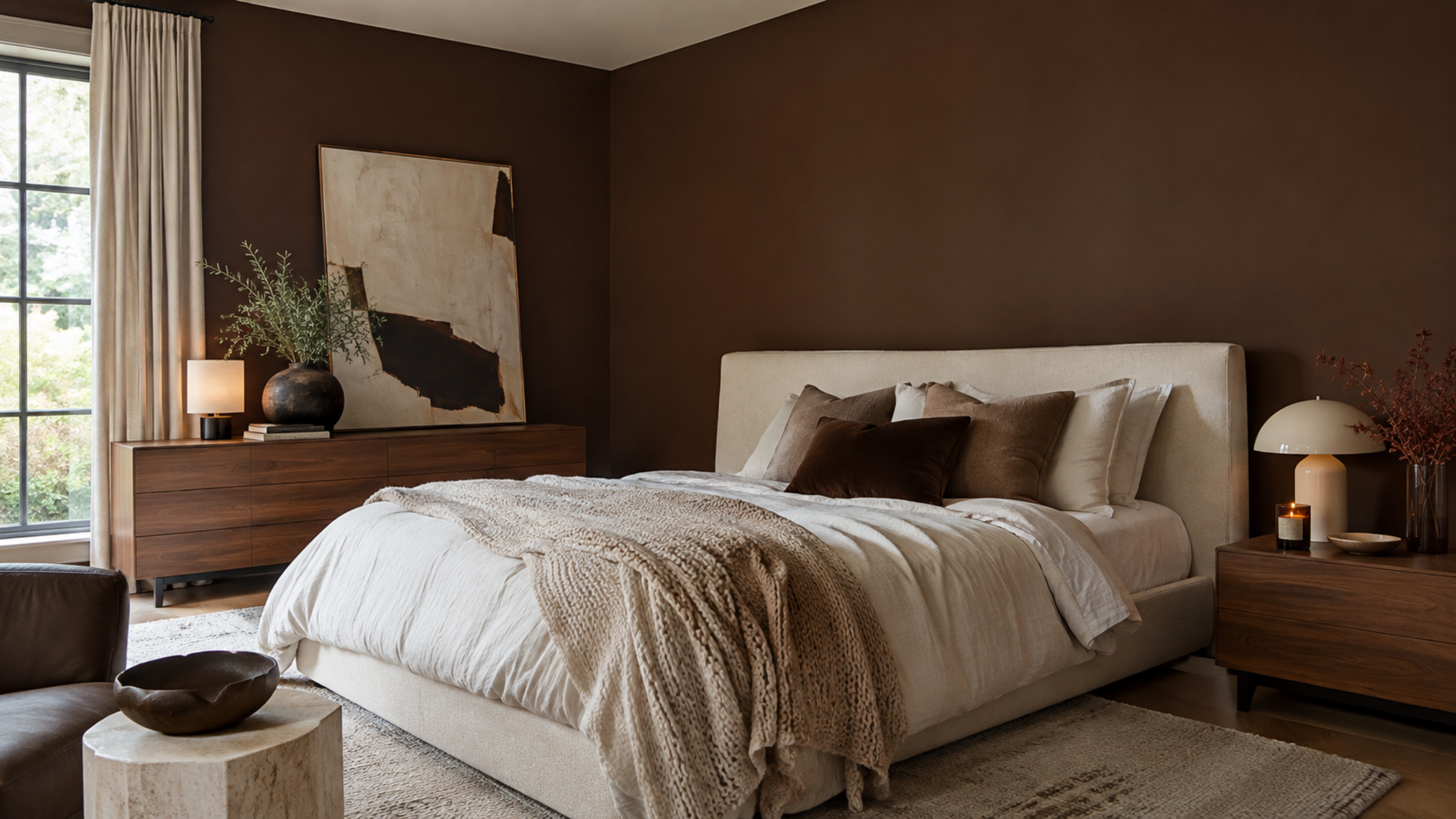
And honestly? I'm kind of obsessed.
The chocolate browns we're seeing now are nothing like those sad beige-brown walls from the early 2000s.
They're deep, rich, and have this cozy, almost dramatic look that I love.
Sherwin-Williams Bitter Chocolate SW 6013 is a really pretty example.
I keep picturing a bedroom with chocolate brown walls, creamy bedding, a vintage dresser, and some gorgeous warm lighting.
Tell me that wouldn't be the coziest room ever.
4. Buttery Yellow
Butter yellow has officially made its way from our wardrobes into our homes, and I feel like this was inevitable.
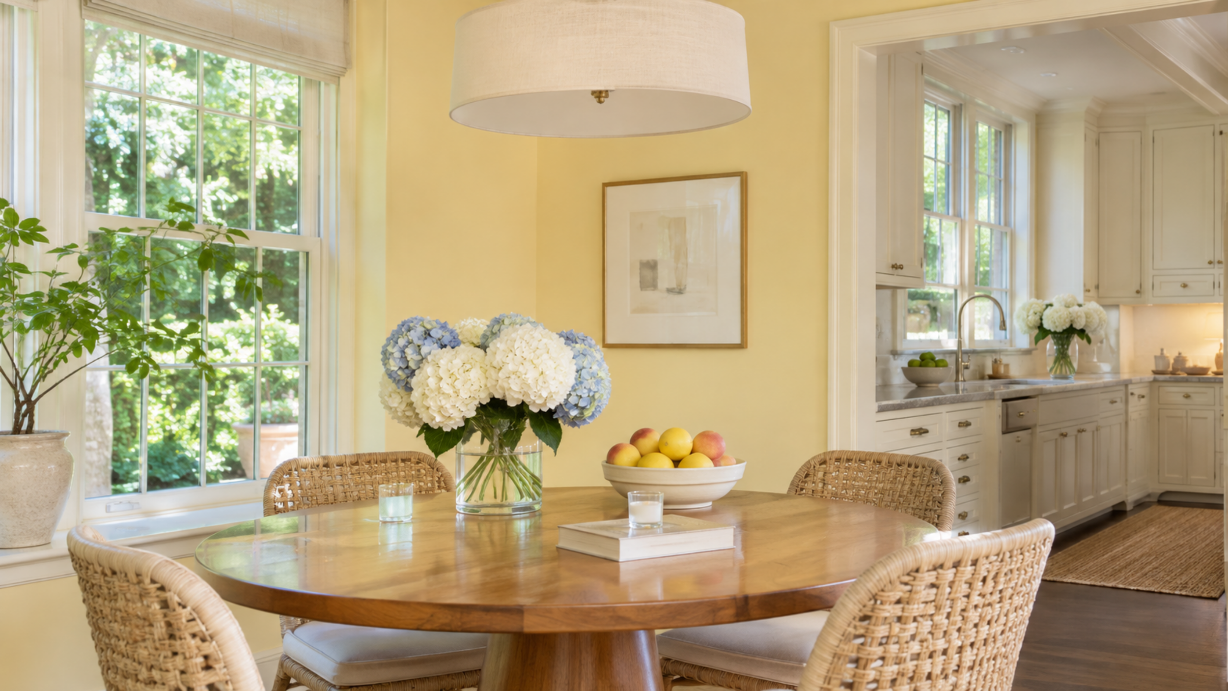
It's just such a happy color without being obnoxiously bright.
Benjamin Moore Shakespeare Tan 228 has that soft, golden warmth that works really well for this look.
I love the idea of using it in a dining room with a dark wooden table and some pretty vintage chairs.
Or a sunny little kitchen with cream cabinets and warm wood accents.
It's giving cozy European cottage, but without feeling like you're trying too hard to make your house look like one.
5. Dusty Pink Walls
Okay, hear me out on pink walls.
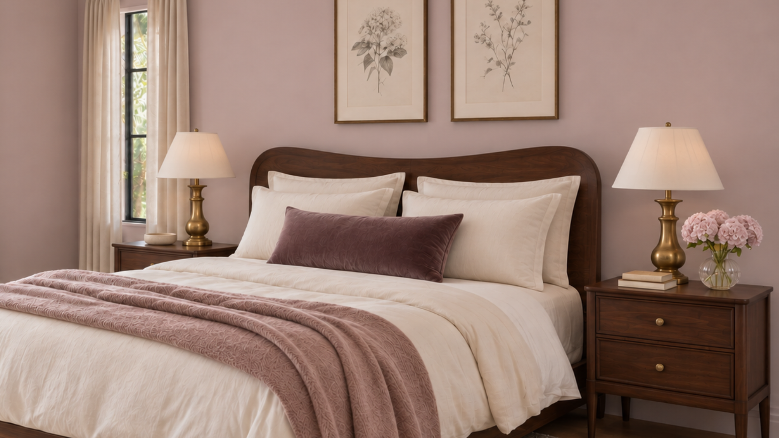
Because I know that probably makes you picture a little girl's bedroom or a very specific shade of millennial pink.
But the pinks we're seeing for 2027 are so much prettier than that.
Benjamin Moore Wild Aster 1240 is this gorgeous muted pink with a slightly dusty, lavender-ish undertone.
It's subtle enough that it almost reads as a neutral in the right lighting.
I would absolutely put this in a bedroom with antique wood furniture, cream bedding, and some pretty vintage artwork.
It feels romantic without being overly girly, which is exactly what makes it work.
6. Warm Cream Instead of Bright White
I don't think white walls are ever actually going away, but I do think we're collectively getting a little tired of the super-bright, sterile-looking ones.
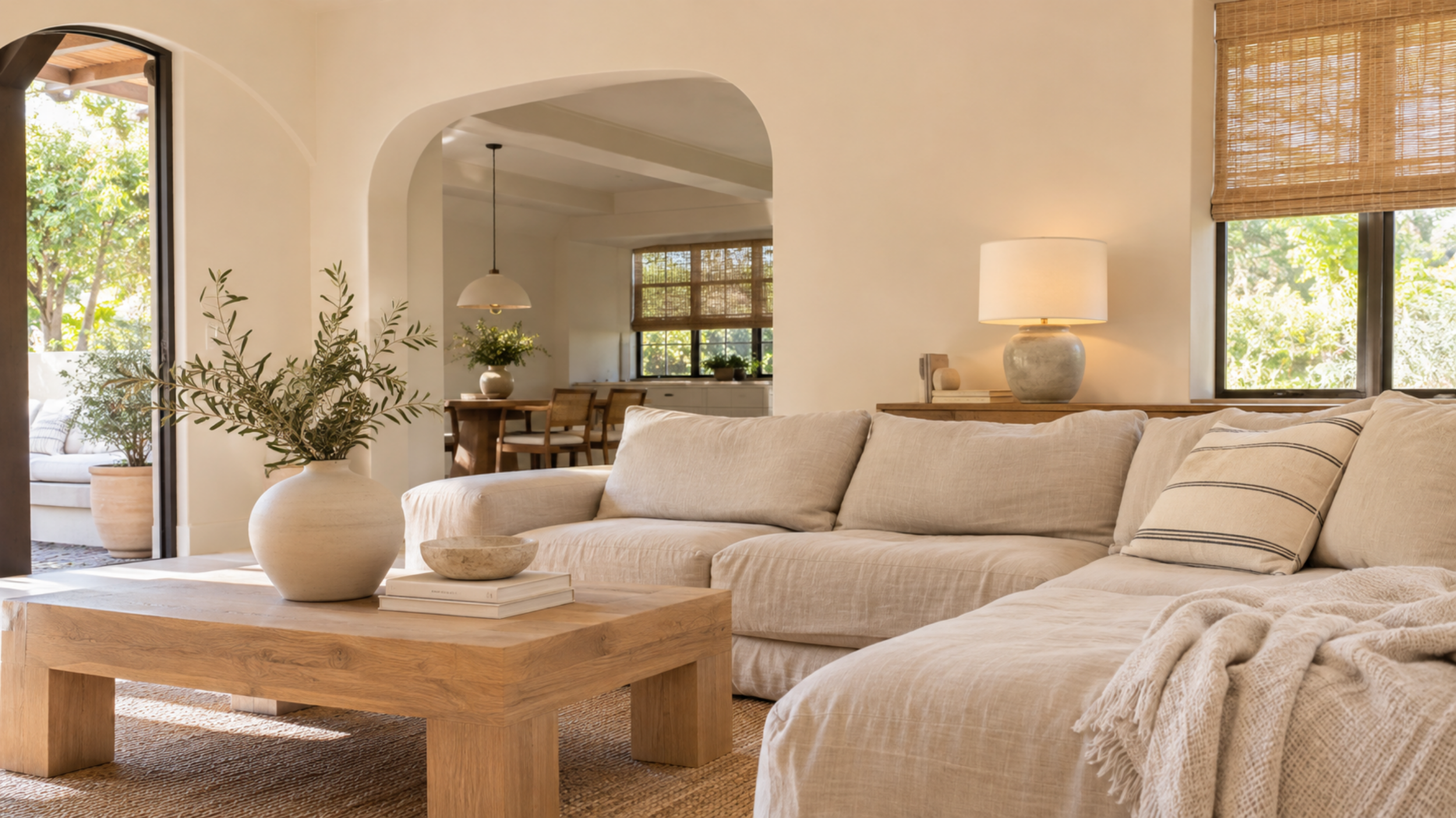
You know the kind that make a room feel like nobody actually lives there?
For 2027, the whites I'm loving are much warmer and creamier.
Benjamin Moore White Down OC-131 and Sherwin-Williams White Duck SW 7010 are both worth looking at if you want that soft, cozy neutral look.
And honestly, if you have a house full of natural wood, warm furniture, and textured fabrics, a creamy white can look SO much better than a stark one.
Sometimes the smallest shift in undertone makes the biggest difference.
7. Terracotta and Burnt Clay
I feel like terracotta is one of those colors that just keeps getting better.
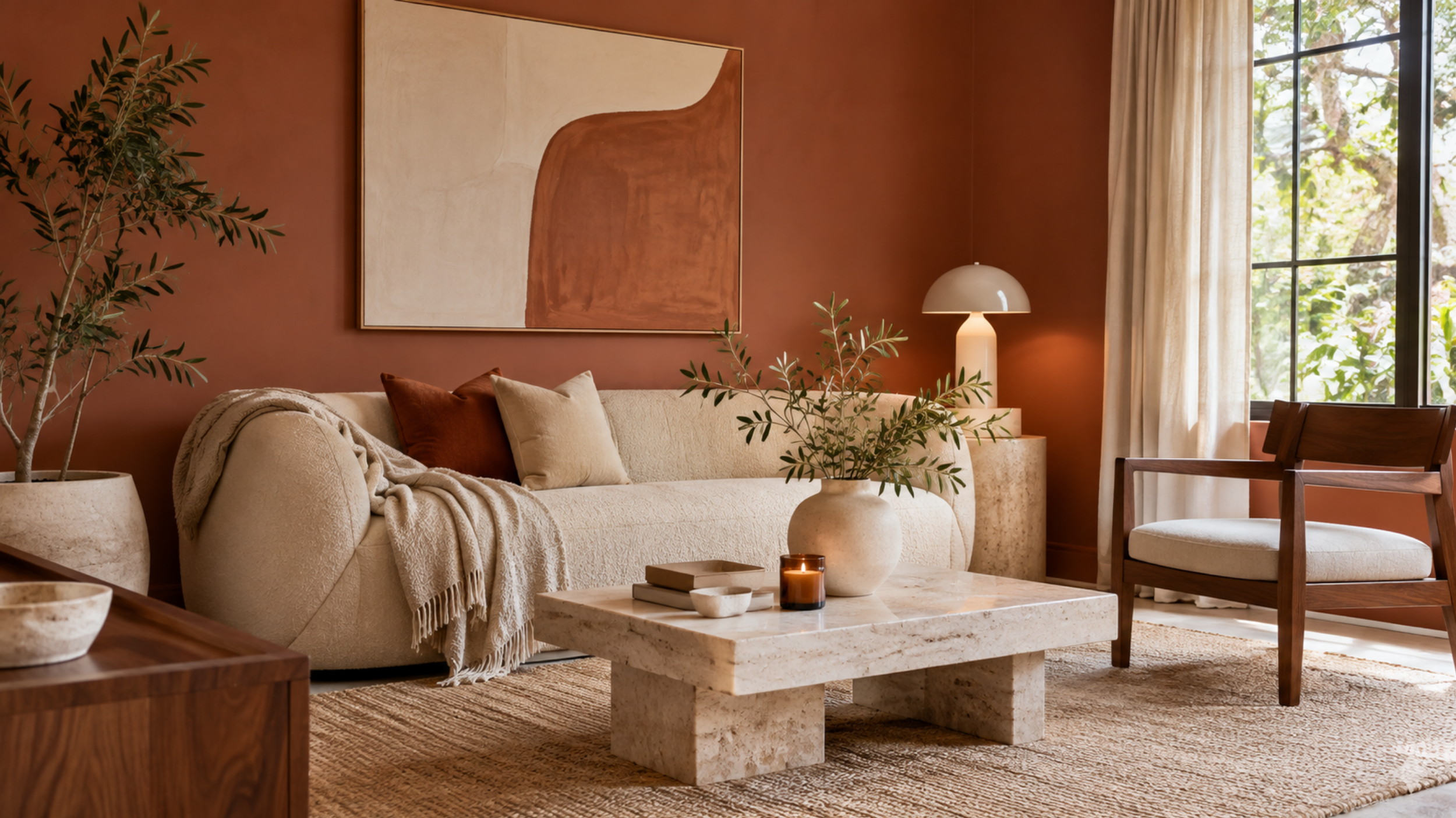
The shades we're seeing now are a little more muted and earthy, which makes them much easier to work into an actual home.
Benjamin Moore Antique Copper 1169 is a really pretty option if you're into this look.
I love terracotta walls with cream furniture, vintage rugs, and lots of natural wood.
It's warm and cozy, but still has enough color to make the room interesting.
And if you're someone who loves that collected, slightly vintage look in home decor, this color just makes sense.
8. Smoky Blue
Blue walls are having a little makeover, and I'm loving the direction they're going.
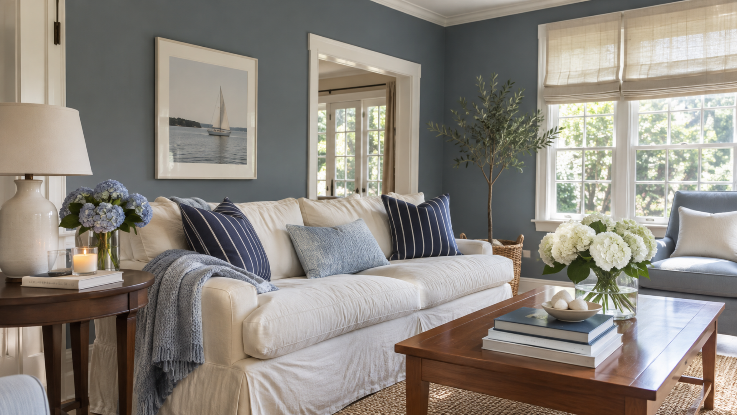
Instead of those bright coastal blues that were everywhere for years, we're seeing more muted, smoky shades that feel a little moodier.
Valspar's 2027 Color of the Year, Cottage Door, is a perfect example.
I could totally see this in a bedroom with cream bedding, dark wood furniture, and some pretty brass lamps.
It's also one of those colors that can feel really classic depending on how you decorate around it.
And I love that it gives you color without making the whole room feel super colorful, if that makes sense.
9. Deep Burgundy
Okay, burgundy walls might be one of my favorite things happening in interiors right now.
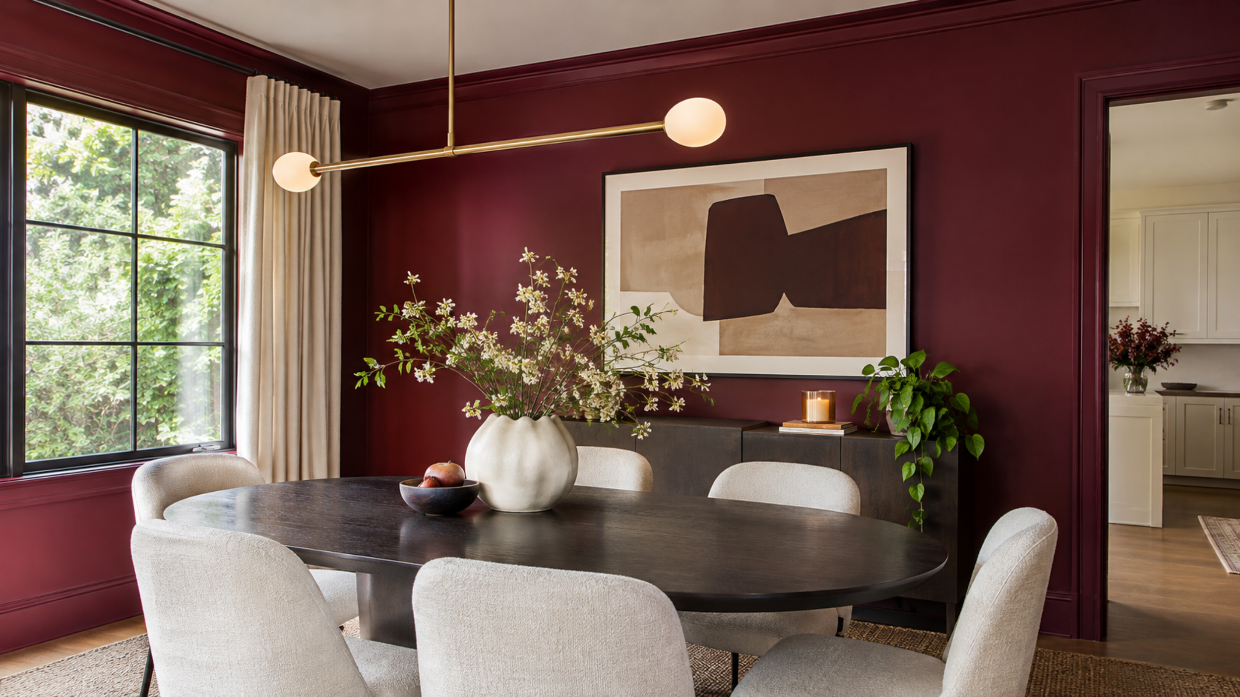
We've already seen burgundy take over fashion, and I'm so glad it's making its way into home decor, too.
There's something about a deep wine-colored room that just looks expensive.
Benjamin Moore Townsend Harbor Brown HC-64 has that rich reddish-brown look if you want something in this color family.
I love the idea of a burgundy dining room with dark wood furniture and warm lighting.
Or even a tiny powder room where you just go all in with the color.
It's dramatic, yes, but in the best possible way.
10. Olive Green
If you're not quite ready for a really dark green, olive might be your sweet spot.
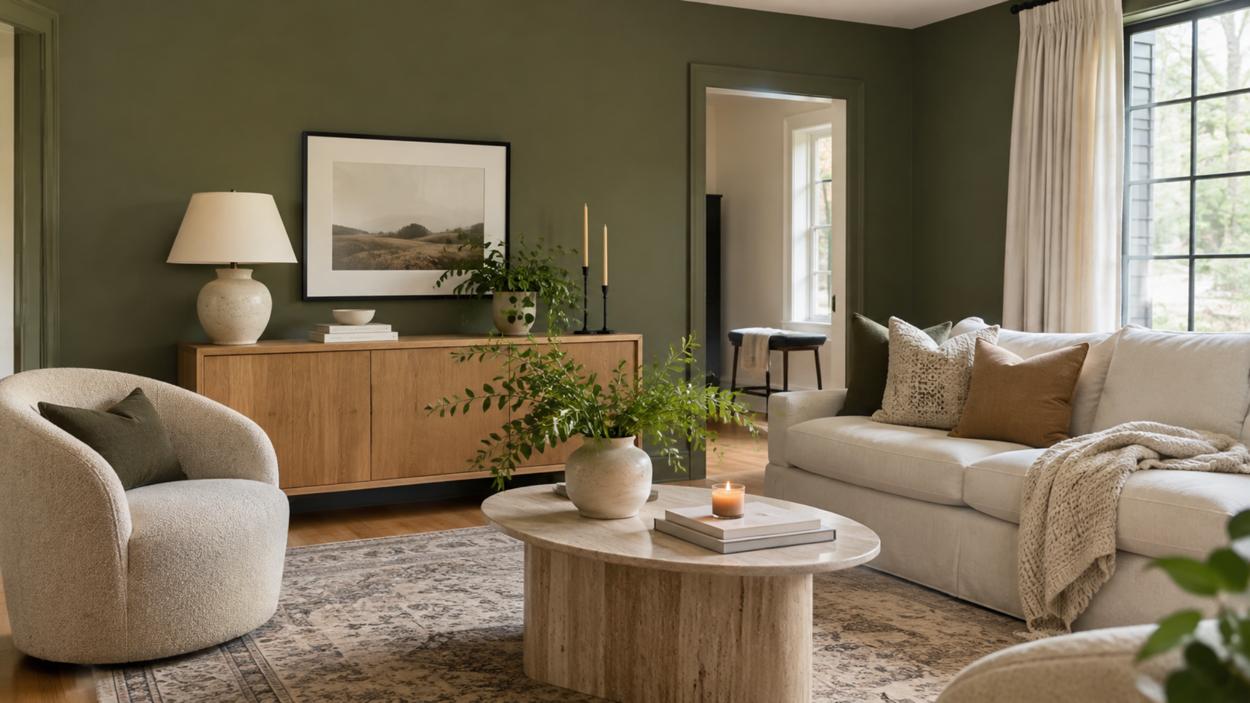
It's earthy, cozy, and somehow goes with almost everything.
Behr's 2027 Color of the Year, Grounded, is a beautiful mossy olive shade that feels very in line with where interiors are heading.
I love olive green with cream furniture, vintage rugs, and warm wood tones.
And honestly, it's one of those colors I feel like you could put in almost any room and make it work.
It has personality, but it doesn't scream for attention.
Creative Ways to Paint Your Walls in 2027
11. Limewash Walls
Can we talk about how gorgeous limewash walls are?
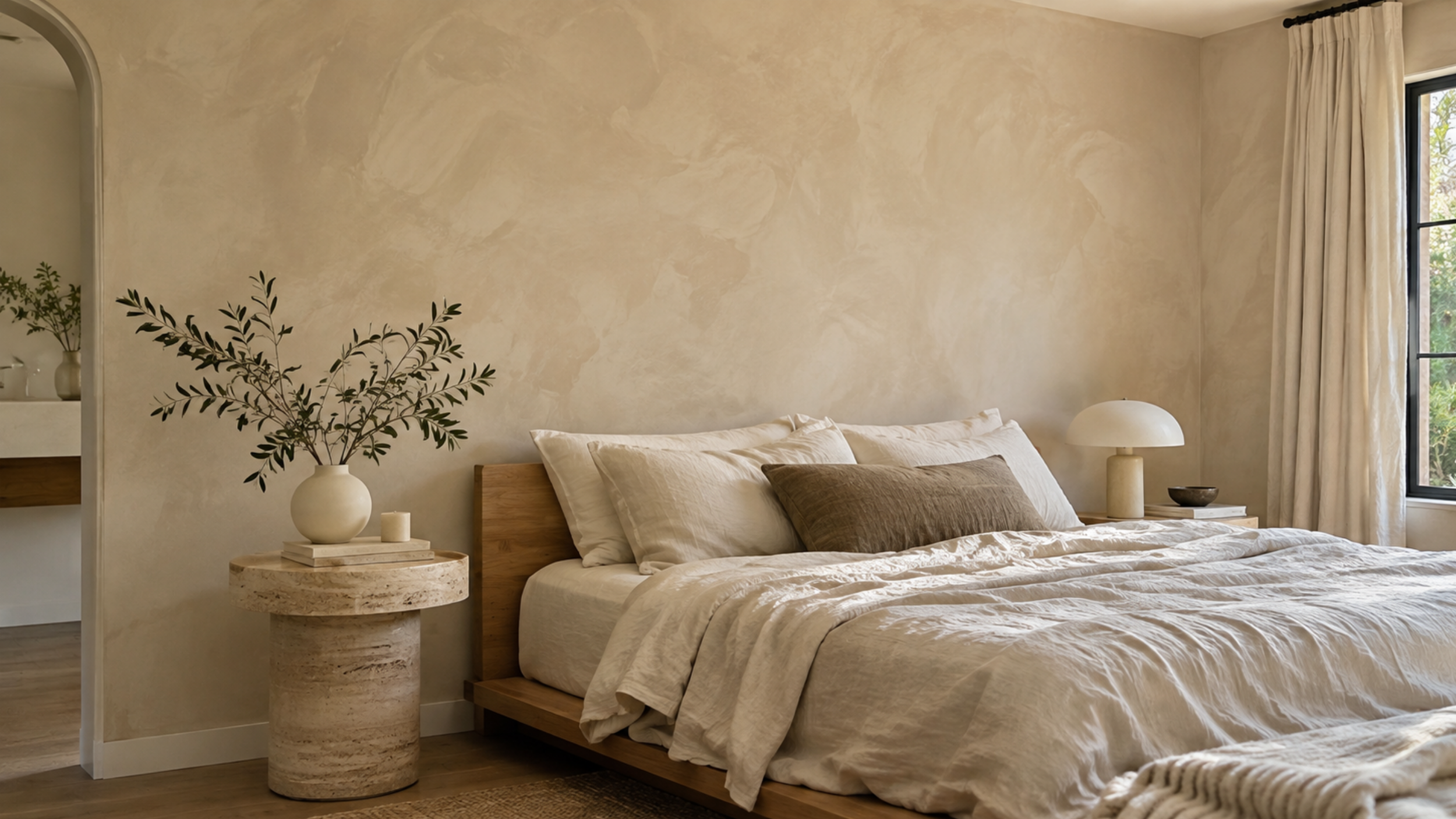
Because every time I see a room with that soft, cloudy texture, I immediately want to recreate it.
It's such a pretty alternative to regular flat paint, especially if you love neutral interiors but don't want everything to feel boring.
The subtle variations in color give the walls this almost stone-like appearance.
I'm particularly into limewash in warm beige, taupe, and creamy off-white shades.
Imagine a bedroom with limewash walls, linen bedding, and some vintage wooden furniture.
I mean, come on.
Just know that it's a little more involved than regular painting, and traditional limewash needs the right surface preparation.
12. Hand-Painted Botanical Details
This might be one of the cutest paint trends on this entire list.
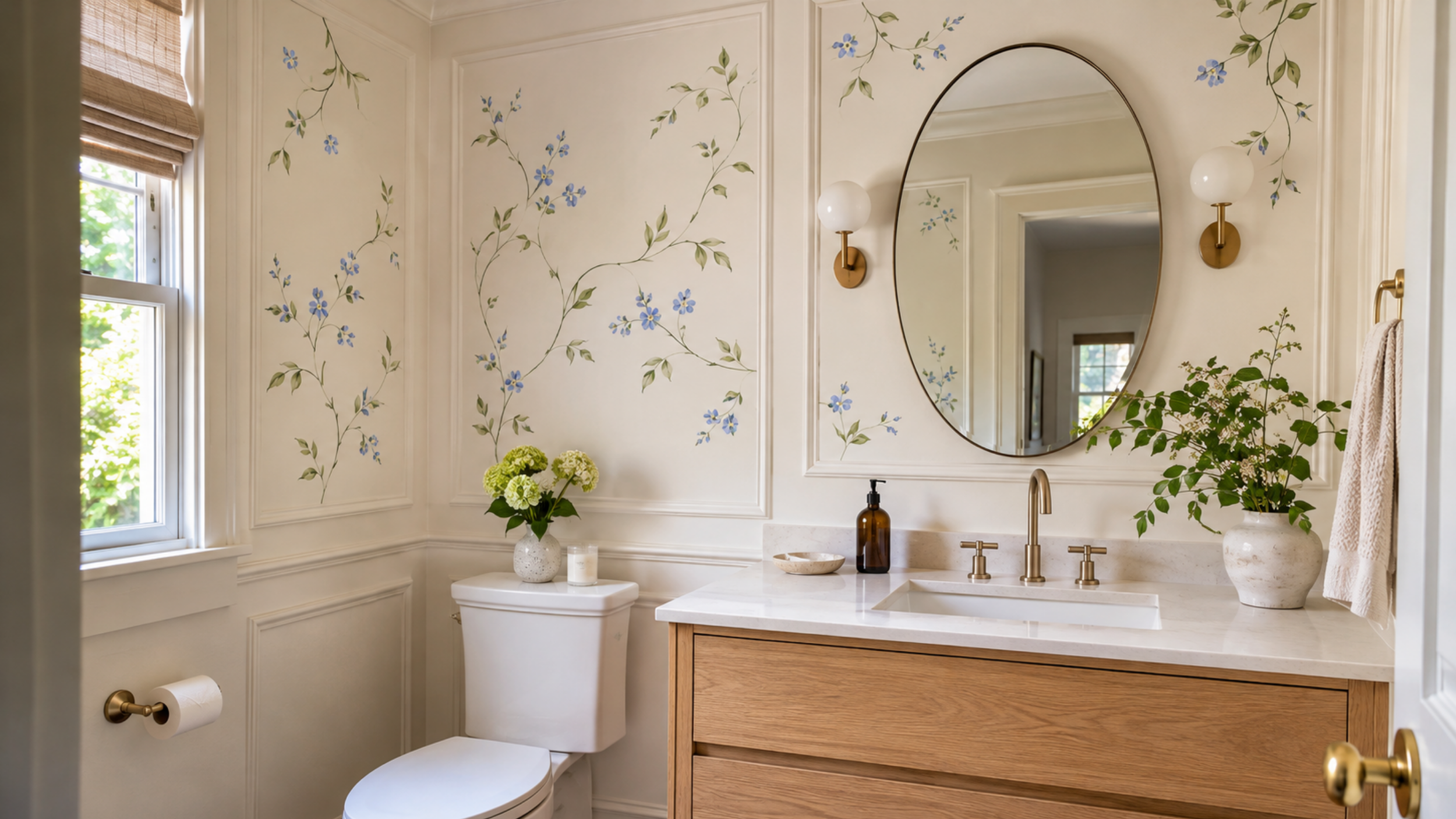
We're seeing these delicate little hand-painted flowers and vines popping up in interiors, and I'm obsessed with how personal they make a space feel.
I'm not talking about a giant floral mural covering every wall.
More like tiny flowers painted inside wall molding, a little vine climbing around a doorway, or some pretty botanical details tucked into a corner.
It's the kind of thing that makes a room feel like somebody actually put thought into it.
I especially love this for bedrooms and powder rooms.
And if you're even remotely artistic, it could be such a fun DIY project.
13. Full-Room Color Drenching
Color drenching is one trend I really hope sticks around for a long time.
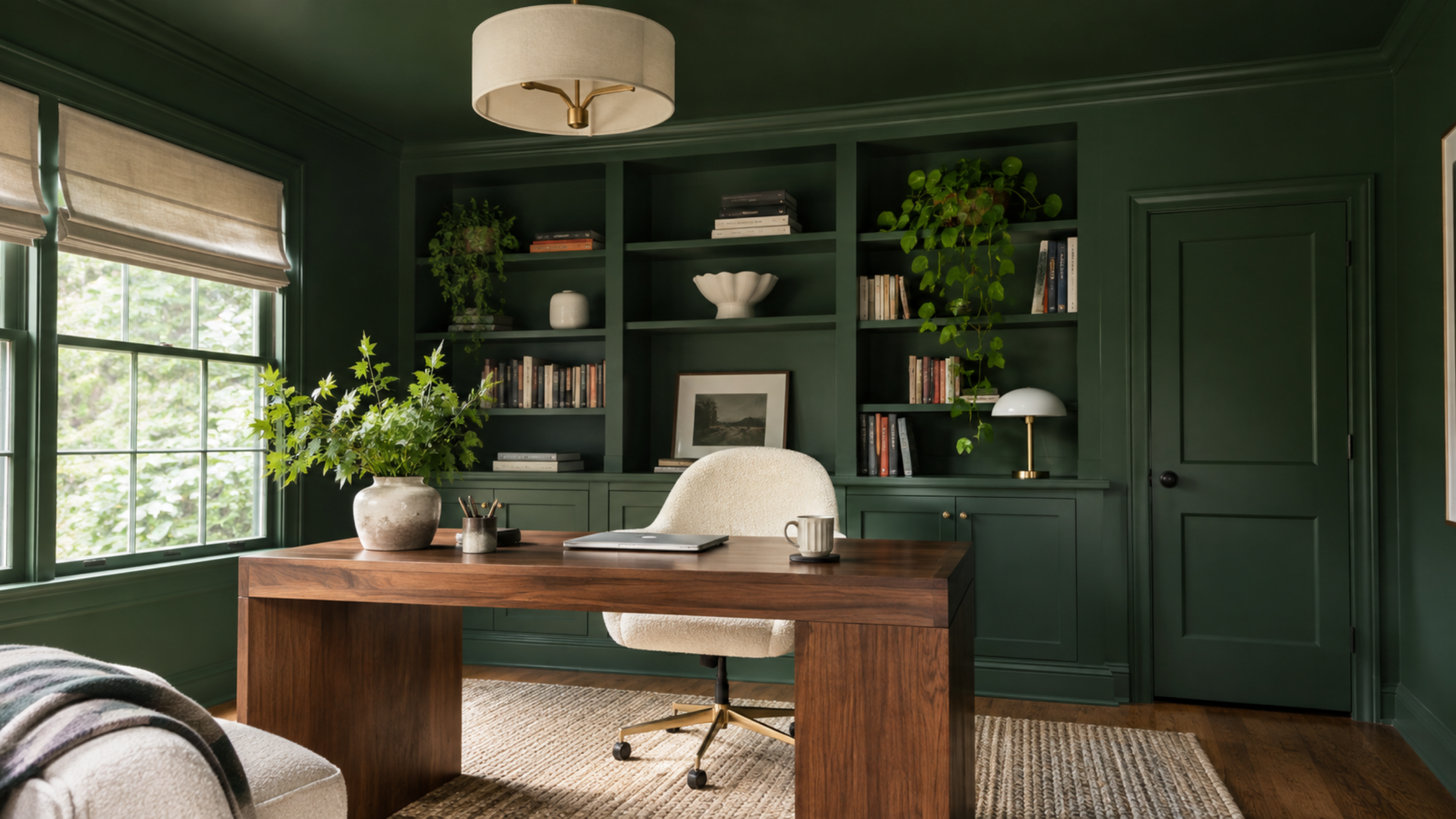
There's just something so good about a room where the walls, trim, doors, and ceiling are all painted the same color.
It makes everything feel so seamless and intentional.
And I actually think it's one of the best ways to use a darker paint color.
Imagine a home office completely drenched in a rich green, or a cozy bedroom where everything is painted chocolate brown.
It's dramatic, but somehow it can also make a room feel really calm.
Plus, you don't have to worry about finding the perfect contrasting trim color.
14. Tonal Color Drenching
If full-on color drenching feels a little intense, this is such a pretty way to get a similar look.
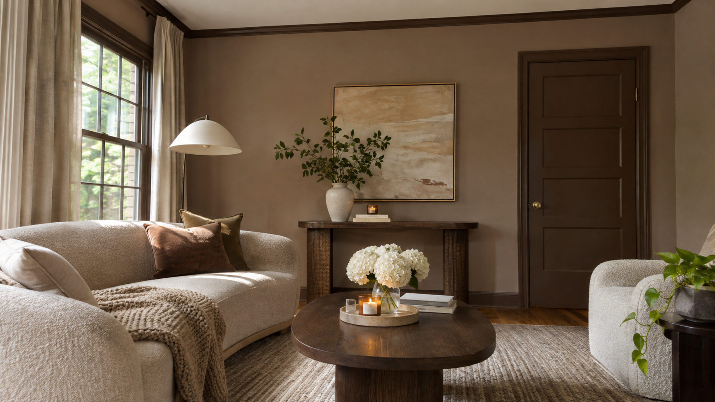
Instead of painting everything the exact same shade, you use different tones from the same color family.
So maybe your walls are a medium taupe, your trim is a deeper brown, and your ceiling is a lighter cream.
Or you could do soft green walls with darker green doors.
I love how layered this looks without having to introduce a bunch of completely different colors.
It's especially good for neutral rooms that need a little something extra.
15. Painted Ceilings
Why do we automatically paint every ceiling white?
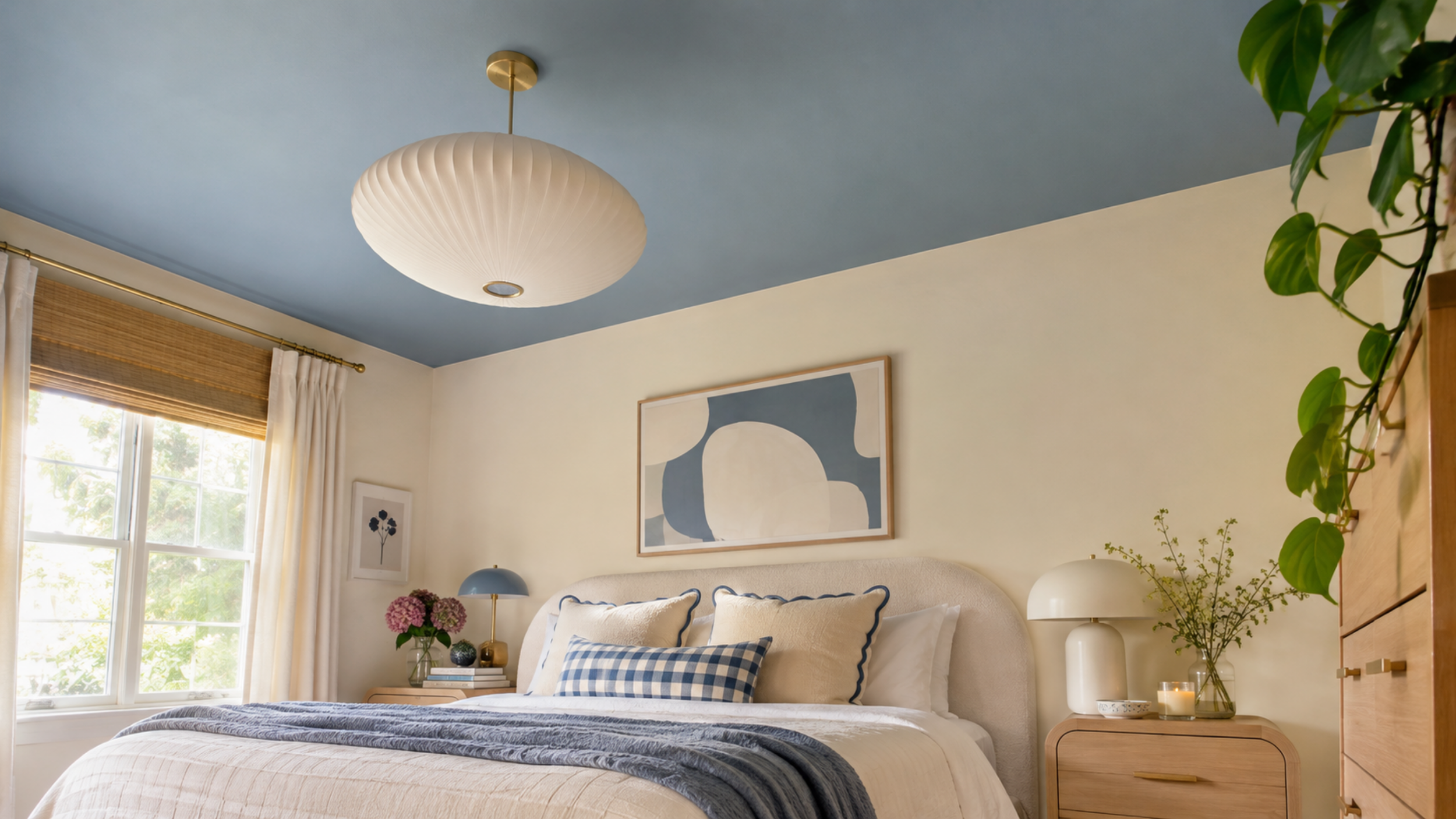
Seriously, because some of the prettiest rooms I've seen lately have color on the ceiling.
And I'm not even talking about anything super dramatic.
A soft blue ceiling in a bedroom with creamy walls would be gorgeous.
Or a muted green ceiling in a dining room.
It's such an unexpected way to add color, and I love that it gives you something interesting to look at without making the walls feel busy.
If you have ceiling molding, even better.
16. Contrasting Painted Trim
I feel like we all just accepted that trim had to be white for the longest time.
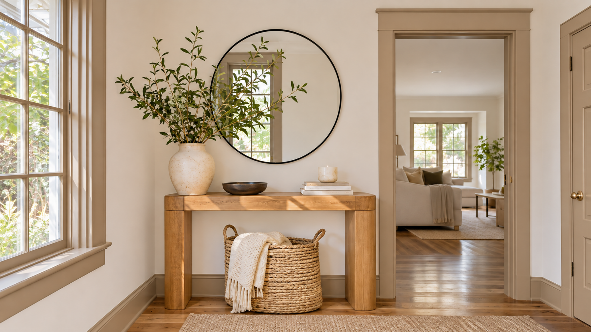
But some of these rooms with colorful trim are making me seriously reconsider that.
Imagine creamy white walls with deep olive green baseboards and door frames.
Or pale blue walls with darker blue molding.
It's such a pretty way to bring color into a room without painting every single wall.
And if you have an older home with gorgeous architectural details, this is such a good way to show them off.
Even just painting the door frames could make a huge difference.
17. High-Gloss Paint Finishes
Okay, glossy paint is coming back, and I actually love it when it's done right.
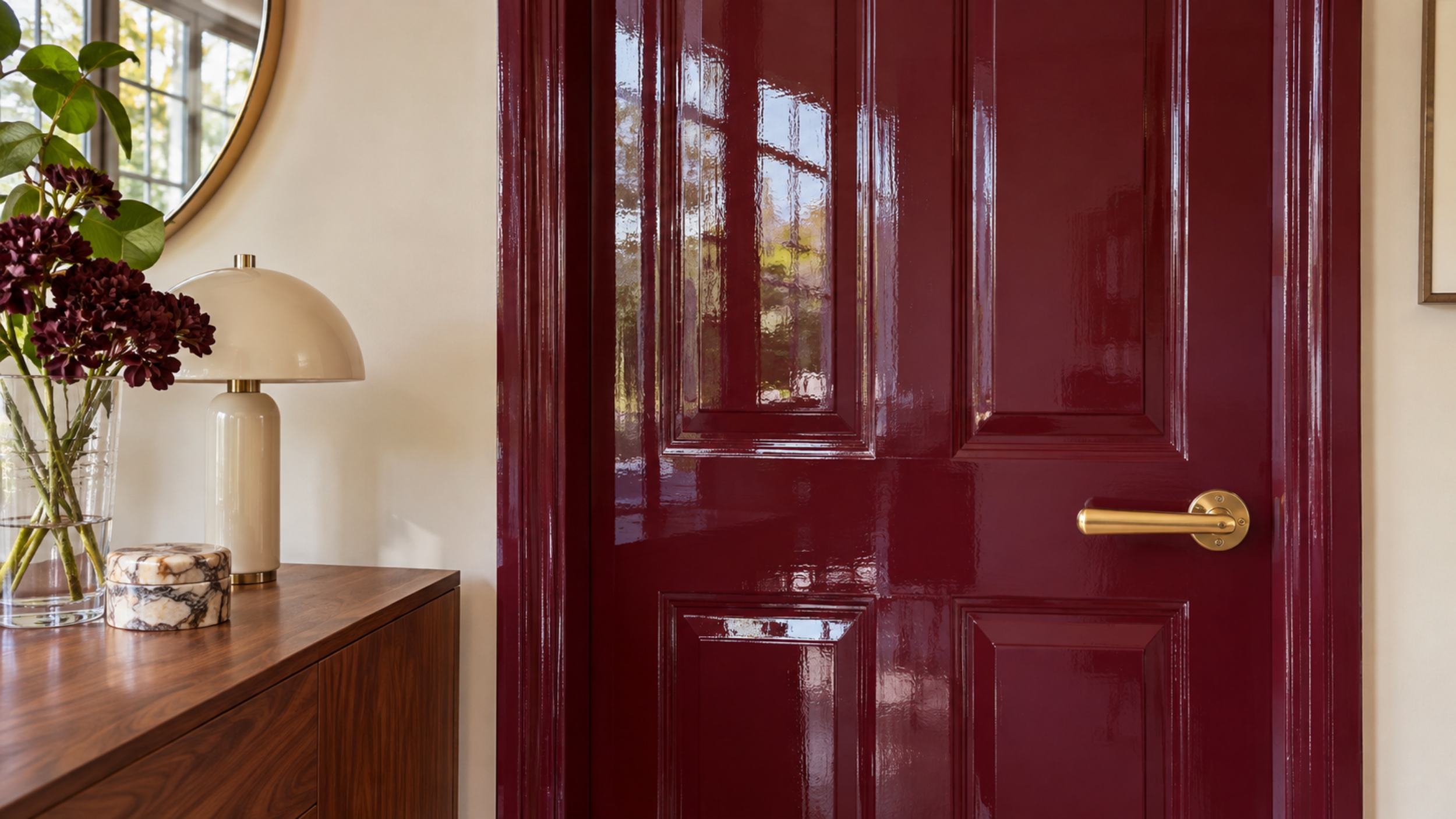
Especially on doors, built-ins, and decorative molding.
There's something about a rich color with a glossy finish that makes it look so much more expensive.
A deep burgundy door in high gloss? Gorgeous.
Chocolate brown built-ins with a little shine? Also gorgeous.
I wouldn't necessarily go painting every wall in my house high gloss, but as a statement finish, I'm into it.
Just keep in mind that glossy paint shows imperfections, so the prep work is important.
18. Painted Interior Doors
This is such an easy one if you want to try a paint trend without turning your entire house upside down.
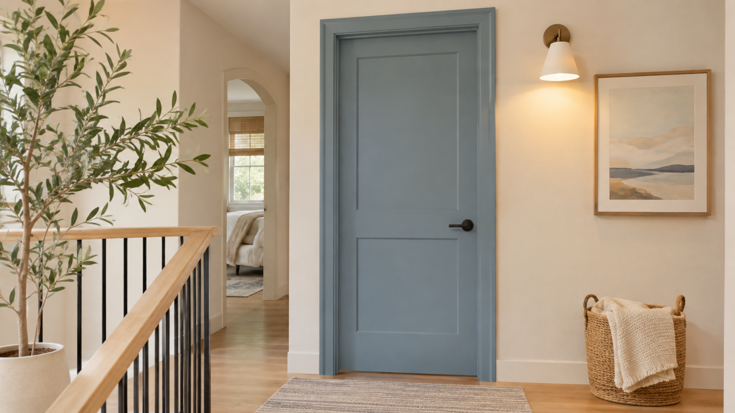
Instead of keeping all your interior doors white, paint one in a fun color.
Olive green, dusty blue, burgundy, chocolate brown. There are so many pretty options.
I especially love when the door and surrounding trim are painted the same shade.
It makes the whole thing look so much more custom.
And honestly, sometimes a small project like this scratches the redecorating itch without requiring a whole room makeover.
Kitchen and Cabinet Paint Color Trends for 2027
19. Deep Green Kitchen Cabinets
I know green kitchen cabinets have been around for a while, but I'm still not over them.
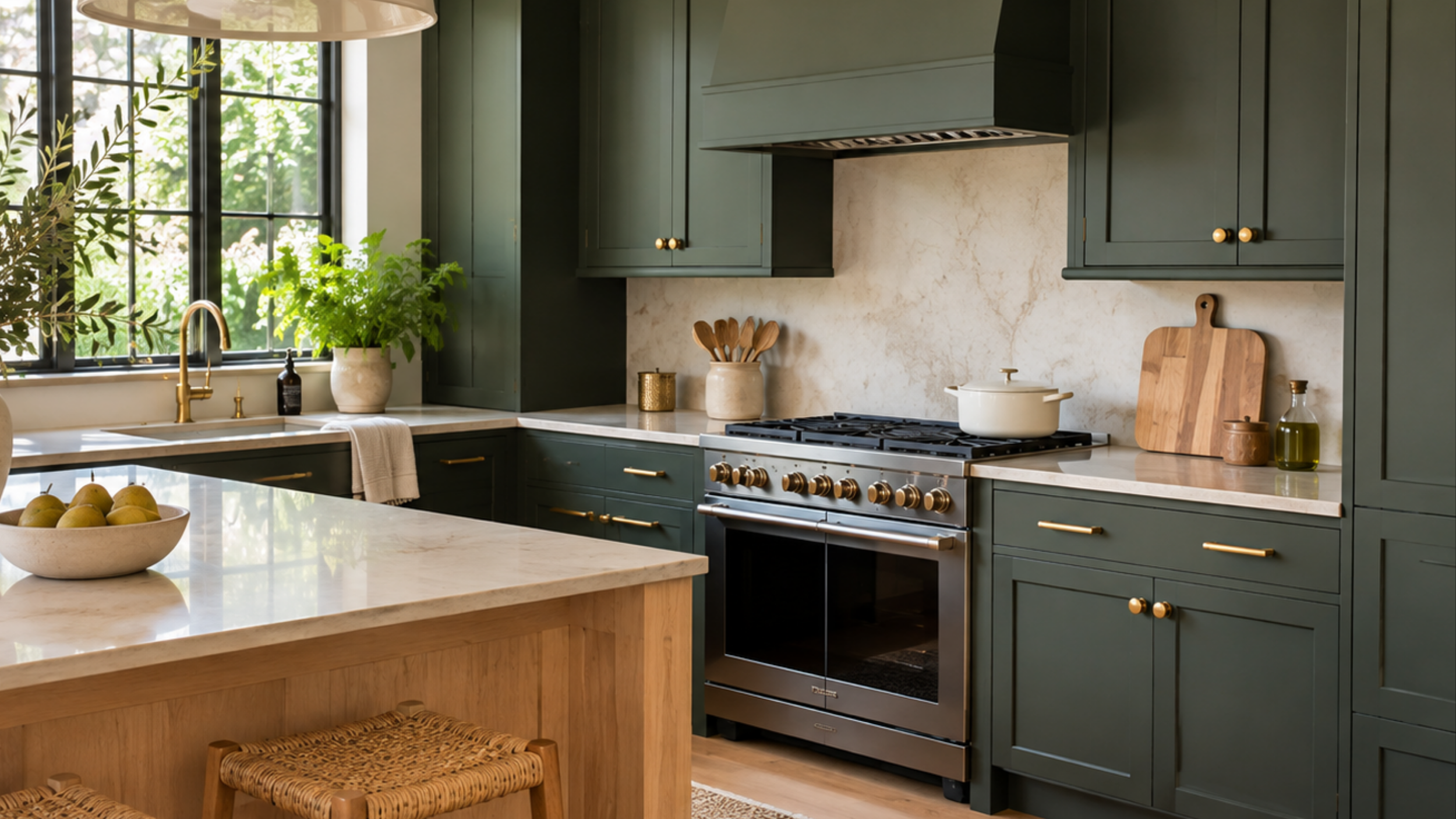
Especially now that we're seeing deeper, moodier shades instead of the lighter sage kitchens that were everywhere a few years ago.
Sherwin-Williams Roycroft Bronze Green SW 2846 is such a gorgeous option.
Imagine it with creamy stone countertops, brass hardware, and warm wood accents.
So good.
I also love that this color can work in both traditional and more modern kitchens.
It feels like a choice you could actually live with for years.
20. Dusty Blue Kitchen Cabinets
There's something about a dusty blue kitchen that just feels so pretty and timeless.
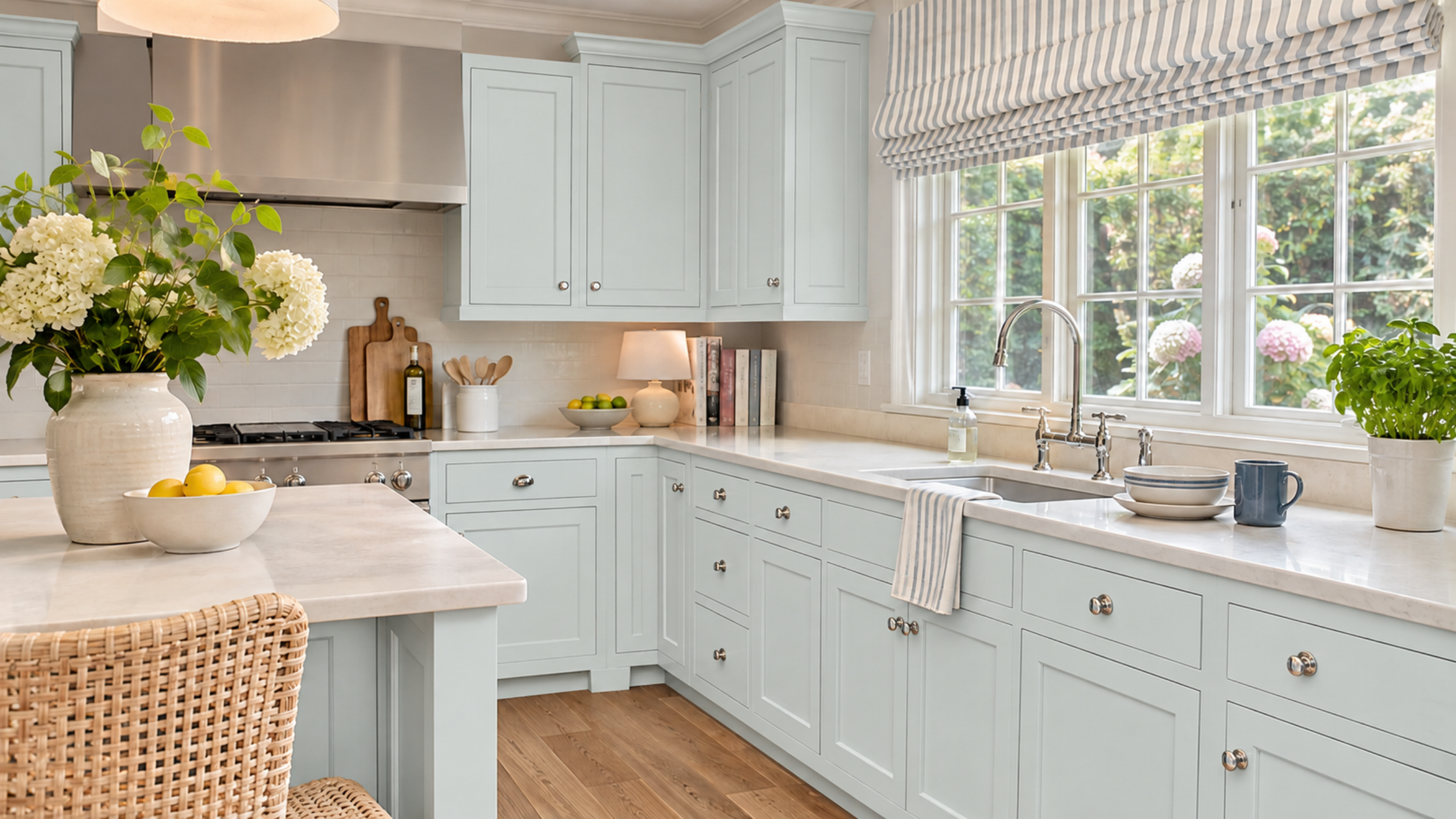
And I love that we're seeing more of these muted blues.
Benjamin Moore Nelson Blue CW-635 is part of its 2027 color palette, and it's a really pretty shade to consider.
I would pair it with creamy walls, warm wood floors, and some simple brass hardware.
It's especially gorgeous in a traditional kitchen with a little bit of a vintage feel.
And honestly, if you're tired of white cabinets but don't want something super dark, this could be the perfect middle ground.
21. Chocolate Brown Kitchen Cabinets
Okay, brown kitchen cabinets are coming back, but not in the way you're probably picturing.
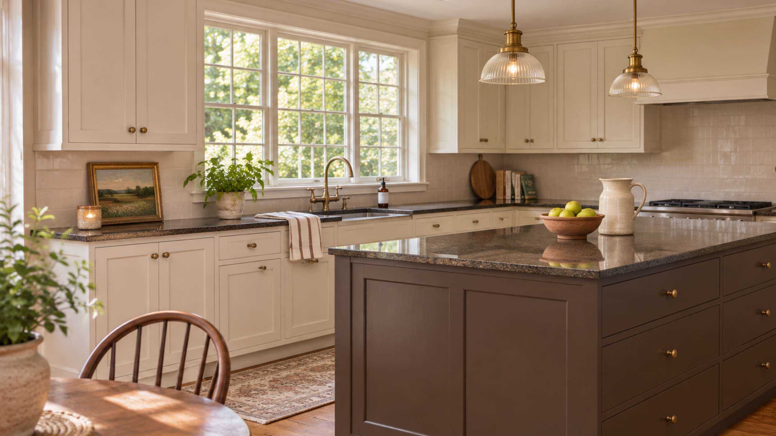
We're not talking about the orange-toned cabinets that were in every house in the early 2000s.
I'm talking about deep, rich chocolate brown painted cabinets that look almost like dark wood.
And I have to say, I'm really into it.
Especially with light stone countertops, creamy walls, and warm brass hardware.
It's moody without being as harsh as black.
And if you're someone who loves a kitchen that feels warm and cozy instead of super bright and modern, this is definitely worth considering.
22. Colorful Pantry Cabinets
I love this idea because it's such a fun way to try a bold color without committing to an entire kitchen.
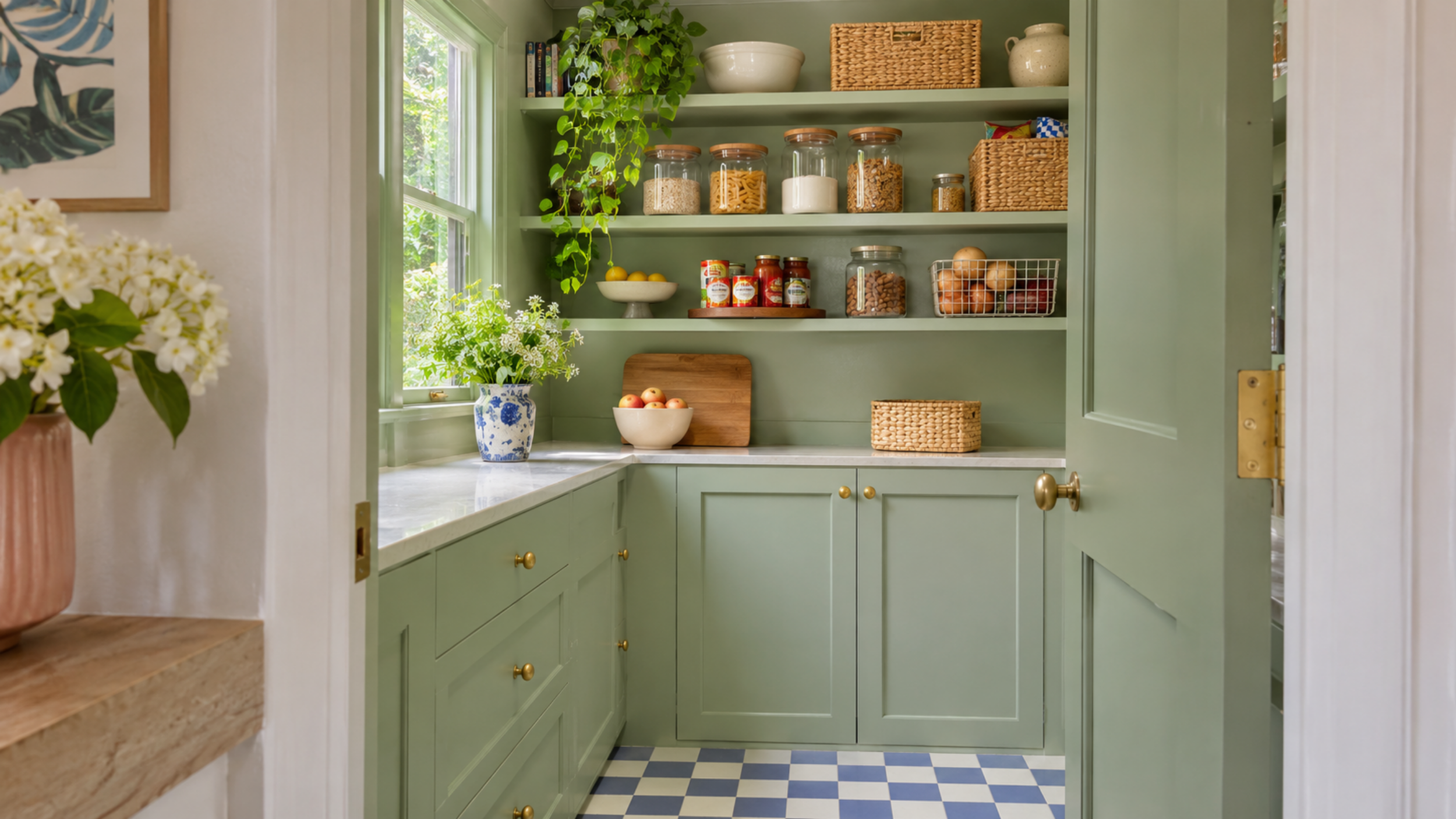
If you have a pantry with its own cabinets or shelving, why not make it a little more interesting?
Imagine opening a pantry door and seeing gorgeous burgundy cabinets.
Or soft celery green shelves with brass hardware.
It's such a small detail, but it makes the space feel so much more special.
And if you have a walk-in pantry, you could even paint the walls and shelving the same color.
Honestly, I think pantries are one of those spaces where you can have a little more fun with decorating.
Statement Paint Ideas Worth Trying in 2027
23. Painted Staircases
I don't know why we don't talk about painted staircases more because some of the ones I've been seeing are SO pretty.
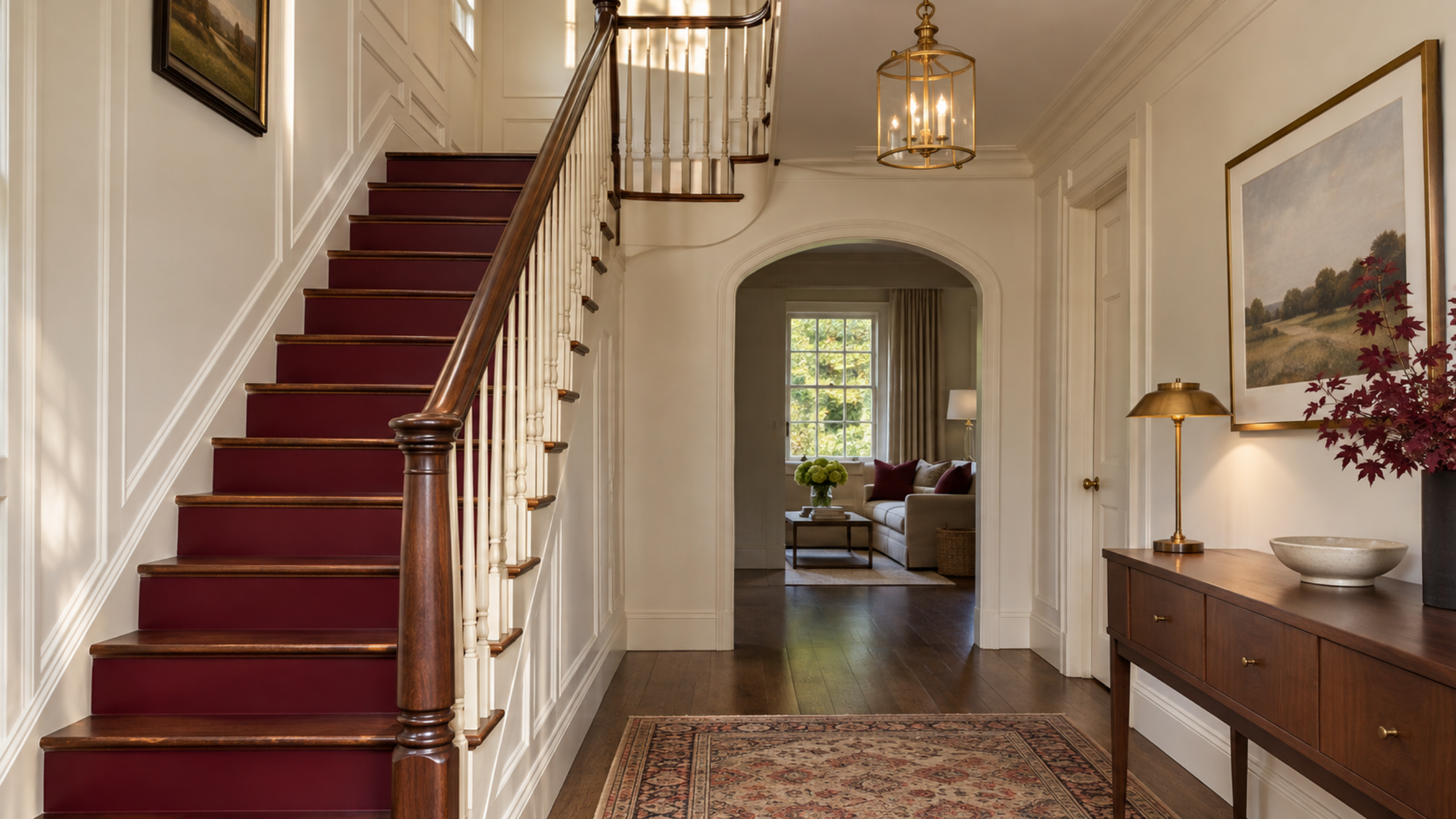
And you don't even have to paint the entire staircase to get the look.
You could do deep olive green risers with natural wood treads.
Or paint the banister a rich burgundy while keeping everything else neutral.
I also love the idea of a dark, glossy staircase in an otherwise light entryway.
It's such a good way to add some personality to a space that usually doesn't get a ton of decorating attention.
Just make sure you're using the right kind of paint if you're doing the actual stair treads, since they obviously need to hold up to a lot of wear.
24. Painted Built-In Bookshelves
If you have built-in bookshelves and they're currently white, this might be your sign to paint them.
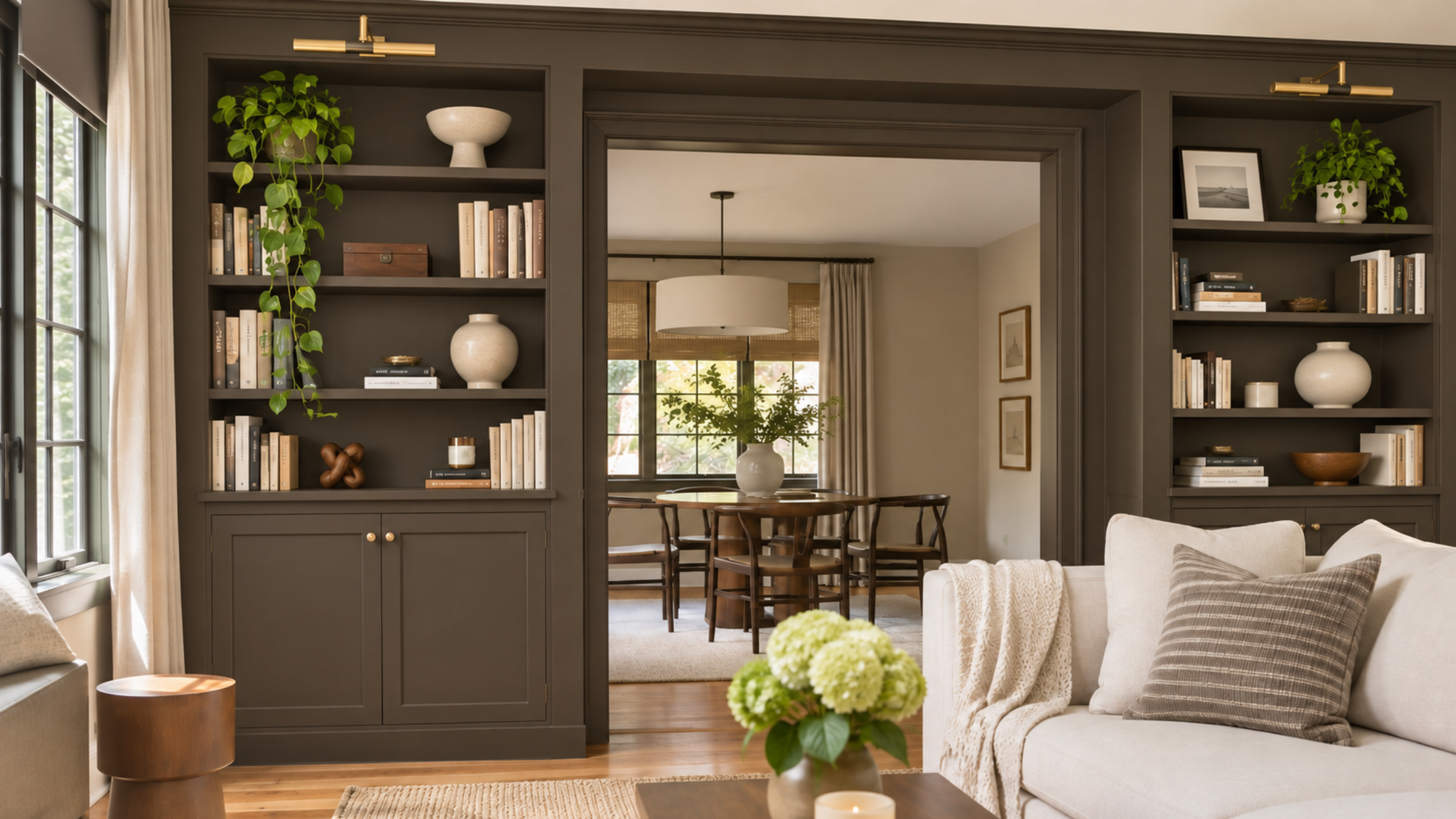
Because the difference a rich paint color can make is actually kind of crazy.
I love the look of deep green bookshelves filled with vintage books, framed artwork, and interesting little decor pieces.
Benjamin Moore Webster Green HC-130 would be gorgeous for this.
You could keep the surrounding walls neutral or paint everything the same color for more of a color-drenched look.
Either way, it's such a good way to make a room feel more custom without changing any of the actual furniture.
25. Two-Tone Walls With Painted Wainscoting
I'm so glad we're seeing more interesting ways to do two-tone walls.
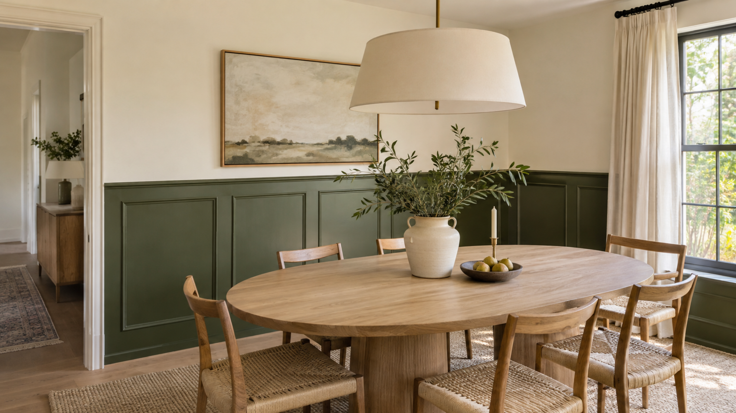
Because those random horizontal paint lines across the middle of a wall were never really my favorite.
But two-tone walls with actual molding or wainscoting? Completely different story.
Imagine deep olive green paneling on the bottom half of a dining room with creamy walls above it.
Or dusty blue wainscoting in a bedroom with a lighter blue on top.
It's such a pretty way to introduce a darker color without making the whole room feel dark.
And it can make even a pretty basic space feel a lot more custom.
I think my favorite thing about the 2027 paint trends is that we're finally having a little more fun with our homes.
Don't get me wrong, I still love a beautiful neutral room. But there's something so refreshing about seeing people embrace colors and details that actually give their homes personality.
Just please, please sample your paint colors before committing. A shade that looks absolutely perfect on Pinterest can look completely different in your actual home!
Love keeping up with the trends?